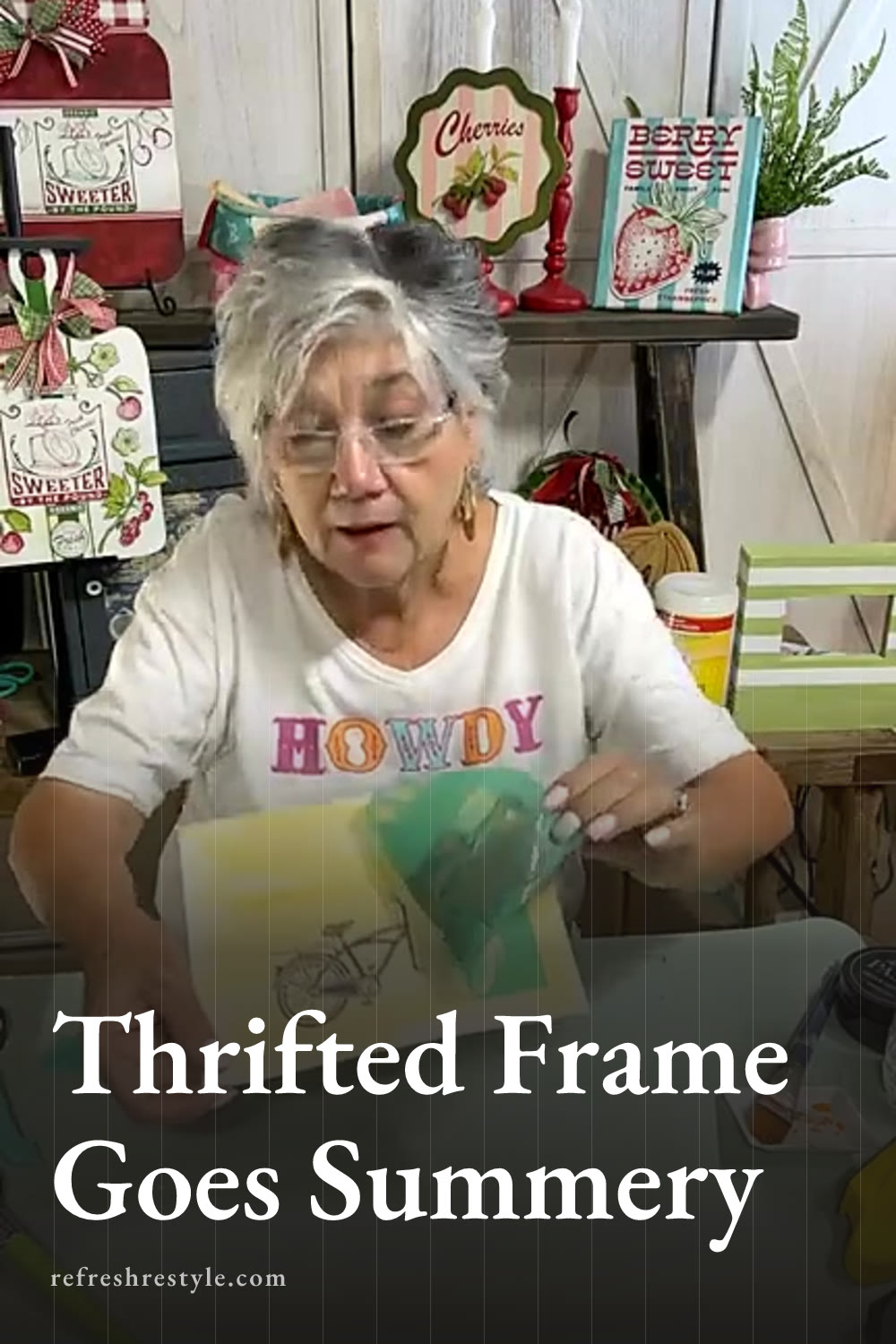
June 24, 2026 by Debbie Westbrooks
Chalk Couture Transfer Thrift Store Frame Makeover
Live Videos · DIY · Home Interior
I gave a $1.99 thrift store frame a cheerful summer makeover with sage green stripes, a colorful ice cream bicycle insert, and Chalk Couture transfers. The wide frame had started out black and a little serious, so I had fun turning it into something bright, rustic, and ready for a favorite summer photo.
Starting with a thrift store frame
The original Barnes and Noble price tag on this frame said $24.95, but I paid only $1.99 at my local thrift store. I love finding pieces like this because the shape and size are already useful, and a little paint can completely change the look.
This frame is extra wide, which gave me plenty of room for stripes and a saying. It can stand on its own, and it also has a hanger on the back, so I have options when I decide where to use it.
I removed the glass and set it somewhere safe before I started working. Then I used a Dollar Tree sanding block to smooth the surface and take away some of the original finish. The refillable sanding tool worked perfectly for this little project and made the frame feel smooth enough to paint.
Painting the frame white and sage
I wet my brush slightly and painted the frame with Bright White. A spray painted base coat would make this part faster, but brushing it on gave me the worn finish I like. I added enough white to cover most of the black while still allowing a little darkness to show through in places.
Once the white paint was dry and had cooled, I used ordinary masking tape to mark off wide stripes. I planned the lower part carefully because I wanted enough open space for a summer saying. I painted the stripes with Sage, a light green that feels fresh and summery.
The paint went on with a soft watercolor look rather than a heavy solid finish. That worked beautifully for this frame. I also painted the inside edge green because it tied the stripes together and looked better than trying to create tiny taped lines in that narrow space.
After removing the tape, I lightly sanded the painted surface again. That brought a little of the dark base through and gave the whole frame a beachy, timeworn look.
Using Chalk Couture transfers on watercolor paper
Making the faded background
For the temporary picture, I used a sheet of watercolor paper. I brushed on some of the white paint that was already on my brush, then added a little orange paint mixed with water. I wiped part of it back with a paper towel because I wanted a faded wash behind the design.
Watercolor paper handles this kind of light painted background well, but it needs to dry completely before adding a transfer. Damp paper can soften and lift when the transfer comes off. I let mine air dry while I worked on the frame, then used my dryer to make sure it was ready.
Adding the Chance of Sprinkles design
I used the Chalk Couture Chance of Sprinkles transfer for the picture. This sweet design has a bicycle style ice cream cart with an awning, a basket, and plenty of little details that are fun to color.
Before placing the transfer on the paper, I fuzzed it on my pants. You can also fuzz it on a shirt or use a fuzzing towel. This reduces the stickiness a little, which helps protect painted paper and freshly painted surfaces.
I used Storm, a gray color, for the bicycle. Then I added teal to the stripes and basket, pink to part of the cart, and orange for more summery color. You can use one color across the whole design, but I wanted this one to feel playful.
Work quickly when using a transfer on paper. I applied one area, lifted the transfer, and then placed it back down lightly to finish the remaining sections. This kept the damp paste from sitting on the watercolor paper for too long.
Adding a summer saying to the frame
The lower section of the frame was wide enough for the words Summertime and the living is easy. I placed the transfer directly over the painted frame and checked its position against the picture opening so the words would look centered.
I chose black for the lettering because it needed to stand out against the white and sage stripes. After pressing the transfer down, I applied the color with a light hand and lifted the transfer to reveal the design.
The clear transfer made it easy to see the placement. If you miss a tiny spot, you can fill it with a small paintbrush or wash the transfer, line it up again, and touch up the area.
Cutting and assembling the picture
I laid the frame glass over my finished watercolor paper to see how much of the bicycle design would fit. The full awning and tires were larger than the opening, so I adjusted the placement until the most important parts showed.
You can trace around the glass with a pencil before cutting if you want a clear guide. Once my paper was trimmed, I put the glass and finished insert back into the frame.
The colorful bicycle makes a cute summer picture on its own, but I made it as a placeholder. Once I take new family photos around the Fourth of July, I can slide one into the frame and save the painted insert to use again later.
Chalk Couture supplies I used
You can shop my full Chalk Couture store here.
I am an independent Chalk Couture designer, so I earn a commission on these links. See my disclosure for more.