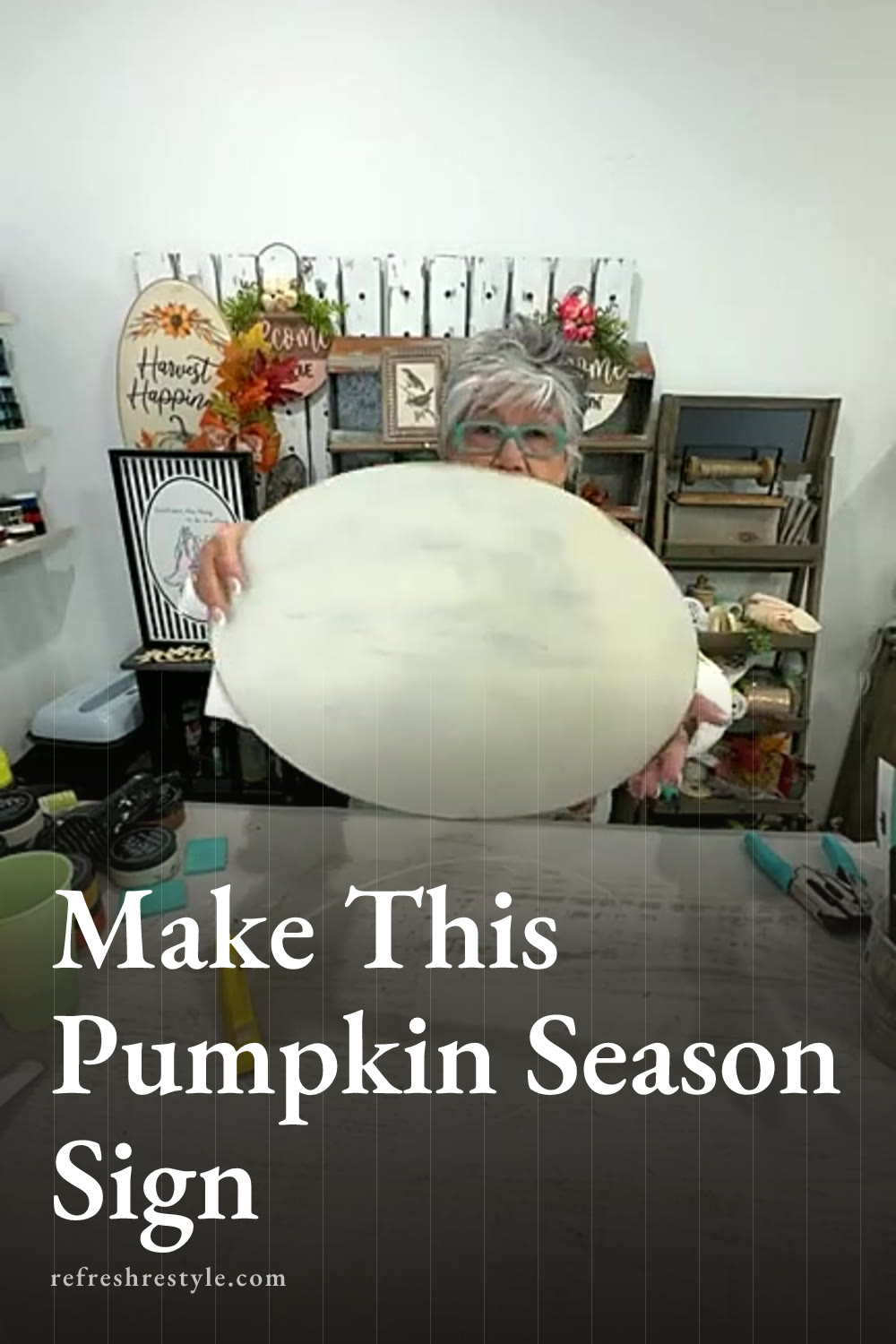
I turned a large oval surface into a warm fall sign filled with pumpkins, layered color, and rustic details. The Chalk Couture transfers made the pumpkin scene easy to create, and a handmade bow gave me the perfect finishing touch when I decided the lettering needed a little balance.
Starting with the large oval surface
I was excited to try this large oval because it gives me so many decorating options. You can turn it in either direction depending on the design you want to use, and the shape feels a little different from the round and rectangular signs I usually reach for.
For this project, I used it horizontally so I had room for a group of pumpkins and the words Pumpkin Season. The wider layout gave the pumpkins plenty of space while still leaving room for a bow along one side.
I started by painting the entire surface Vanilla, which is one of my favorite almost white colors. It gives me a soft background that works beautifully with warm fall shades. I dampened my paintbrush slightly, shook off the extra water, and brushed the paint across the oval.
A sponge brush would work here too. Use whatever brush gives you the finish you like.
Adding my favorite distressed finish
Once the painted surface was ready, I sanded it to bring back some of the darker surface underneath. I love distressed projects, so I let the edges and a few spots across the front look worn and aged.
You can make your finish as smooth or as distressed as you like. A solid coat of paint would give this sign a cleaner look, while heavier sanding creates more of that rustic farmhouse style. I always want you to follow your own decorating style because that is what makes a handmade project feel right in your home.
The slightly uneven coverage from my brush actually worked in my favor. Since I planned to distress the surface anyway, those variations added character and helped me get the look I wanted.
Creating the Chalk Couture pumpkin design
I used two different Chalk Couture designs for this project. One gave me the pretty group of pumpkins, and the other included the words Pumpkin Season. I only used the lettering from the second design because the pumpkin grouping already filled the main part of my oval.
Before placing the pumpkin transfer, I added a little fuzz to reduce some of its stickiness. These transfers are reusable and easy to reposition, so I could lift and adjust the design until it looked centered. Once I liked the placement, I pressed it down well and smoothed out any bubbles.
For the pumpkins, I chose Butterscotch and Shimmer Spiced Citrus. I used what I call the hot mess technique, which simply means adding both colors across the transfer and letting them blend as I squeegee.
I placed small amounts of each color in different areas, then pulled the paste across the design. A light hand works best here because too much mixing can turn the colors into one shade. I wanted the pumpkins to have a soft variation with bits of golden yellow and shimmering orange showing through.
When I lifted the transfer, the pumpkin details were all there. The layered colors made the design feel full and interesting without any extra painting or watercolor work.
Adding the Pumpkin Season lettering
Next, I placed the Pumpkin Season lettering beside the pumpkin group. Part of the letter S overlapped a pumpkin slightly, and I liked how the two designs looked together.
I used Espresso for the words because the deep brown kept everything in the same warm fall color family. Black would also work, especially if you prefer stronger contrast or plan to make your version on a chalkboard style surface.
You only need a small amount of paste. I spread it over the lettering, squeegeed away the excess, and returned the extra to the jar. That little habit helps the paste last through plenty of future projects.
After lifting the transfer, I realized I could have moved the words over a little more. Handmade projects have a way of changing as I go, so I decided to add a bow to fill the open area and balance the design.
Making the rusty wire hanger and bow
I punched holes near the top of the oval and threaded rusty wire through them to create a hanger. I curled the wire around itself, which added another rustic detail and worked well with the distressed paint.
For the bow, I started with a larger piece of ribbon as a background layer. Scrunching the ribbon instead of building a full bow helped me get the size I wanted without using more ribbon than necessary.
I cut three additional pieces, dovetailed the ends, and gathered them in the center. My glue gun was already hot, so I attached the finished bow beside the lettering where it filled that open space. What started as a placement adjustment became one of my favorite details on the sign.
More color ideas for this pumpkin sign
Butterscotch and Shimmer Spiced Citrus created the classic fall look I wanted, but this pumpkin design would also be beautiful in heirloom pumpkin colors. Soft cream, dusty blue, muted pink, and pale green would give the same design a completely different feeling.
You could also use the pumpkin grouping by itself or make a simple sign with only the Pumpkin Season lettering. Classic black and white would look especially pretty on a chalkboard surface.
The oval can hang from the rusty wire, and its generous size makes it a lovely piece for seasonal decorating. Changing the colors, ribbon, or direction of the surface gives you plenty of ways to make this Chalk Couture pumpkin sign fit your own fall decor.
Chalk Couture supplies I used
You can shop my full Chalk Couture store here.
I am an independent Chalk Couture designer, so I earn a commission on these links. See my disclosure for more.